I Made the Same Landing Page Forty Times (So You Don't Have To)
On design systems, an AI agent called Claude Design, and the quiet joy of never having to reformat a social post and landing page again.
There is a particular kind of Tuesday afternoon I want to tell you about, because I have a strong suspicion you've had one too. It's about four o'clock, the light is starting to give up, and you are staring at the eleventh version of a banner that says GET STARTED FREE. The first ten were fine. Genuinely fine. But someone in a thread has used the word "punchier," and now here you are, nudging a button two pixels to the left and wondering, not for the first time, whether this is what you imagined your life would be when you were nineteen and full of ideas.
I've done a lot of these afternoons. And the thing nobody tells you about making design materials — the banners, the social cards, the landing pages, the forty-seventh variation of an email header — is how little of it is actually designing. Most of it is doing the same thing again. Same look, new size. Same look, new headline. Same look, but this time for LinkedIn, which has opinions about dimensions that I will not bore you with here. It's not creativity. It's carpentry, mostly, and not the satisfying kind where you end up with a table.
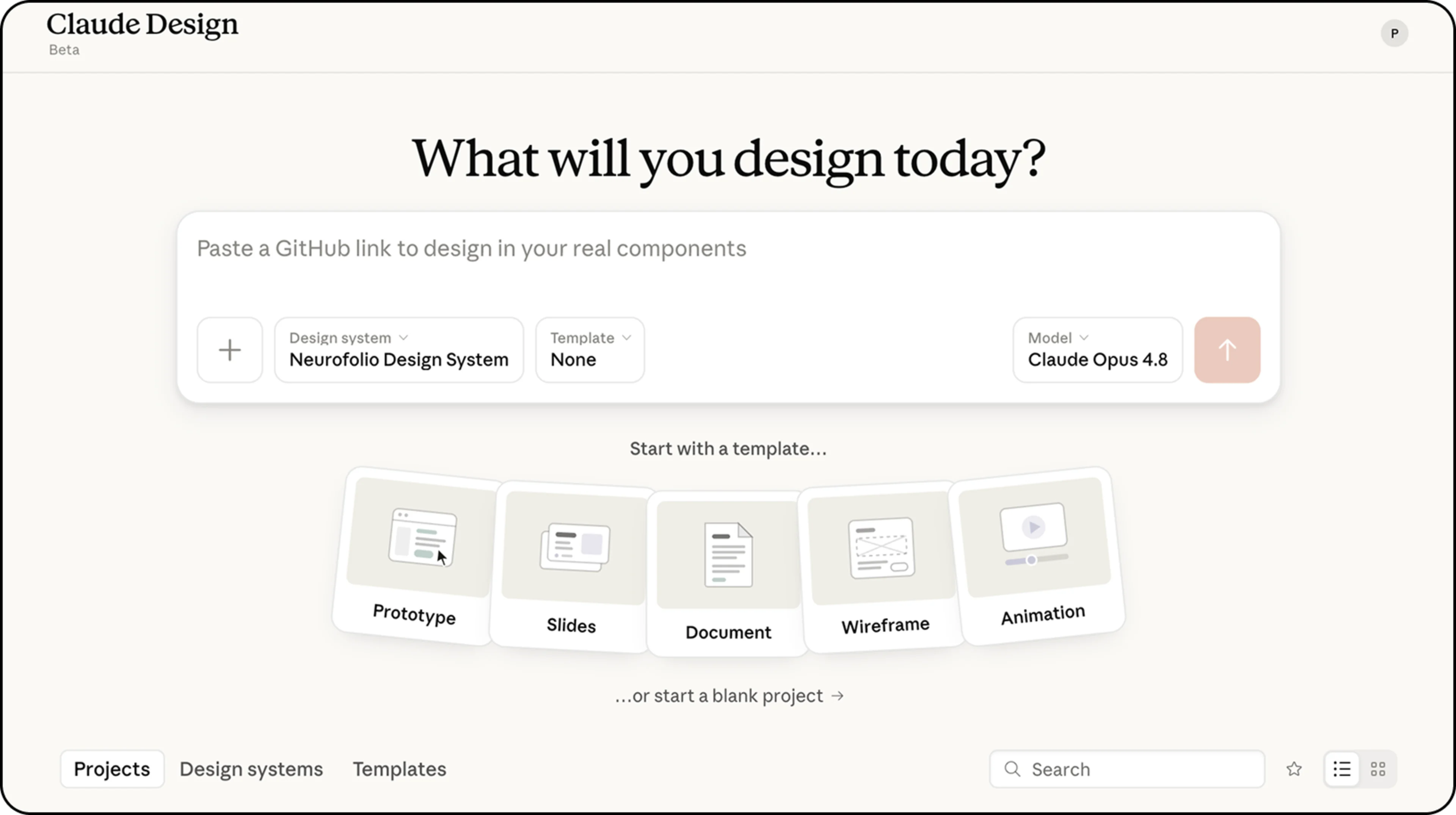
When people started getting excited about AI doing design, my honest first reaction was a sort of delighted curiosity. Sure, I knew the clichés "AI design" could fall into — purple gradients, a little sparkle icon, the visual equivalent of a man in a gilet telling you to "disrupt." But I had a hunch there was something real underneath the hype, and I couldn't wait to find out.
And then I actually tried it properly, with a real design system underneath it, and I have to tell you — exactly as I'd hoped — that it changed the Tuesdays.
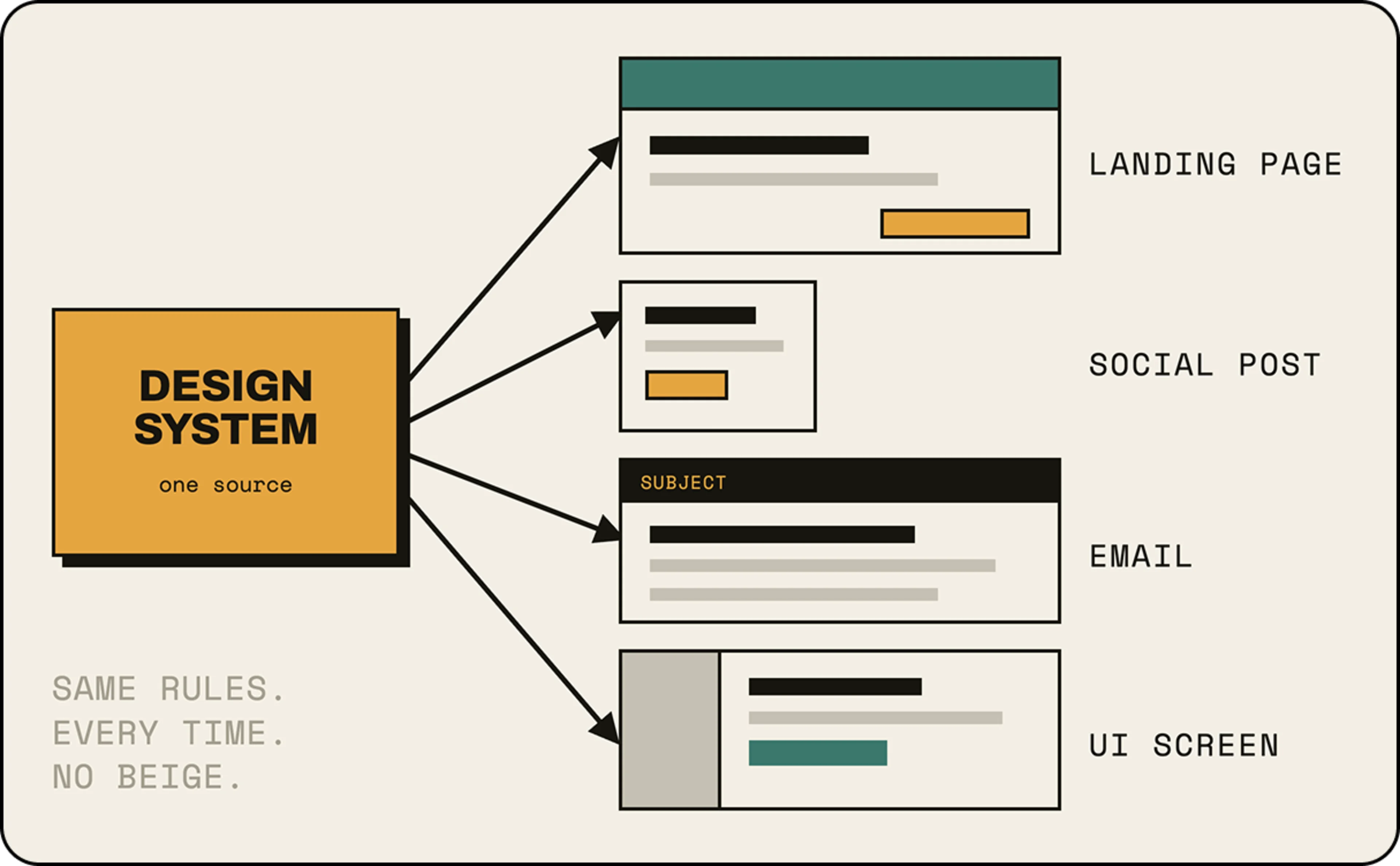
#The Design System
Here's the bit that took me far too long to understand. An AI design agent on its own — and I'm talking specifically about Claude Design, the one I ended up living inside — is only as good as what you point it at. Ask it for "a nice banner" and you'll get something that looks like every other nice banner on earth. Garbage in, beige out. But give it a proper design system, a real one with rules and bones, and something quite different happens. It stops guessing and starts obeying. Which, it turns out, is exactly what you want from the carpentry.
A design system is just the grown-up version of "house style." It's the colours you're allowed to use and, more importantly, the ones you're not. It's the typeface, the weight of the borders, the size of the gaps, the voice of the words. Most teams have one rattling around in a Figma file that three people have read. The trick is that an AI agent will read it cover to cover, every single time, without sighing. It never forgets that the heading is meant to be enormous. It never quietly reaches for a slightly different blue because it was feeling adventurous on a Thursday.
To show you what I mean — and because abstract talk about design systems is the conversational equivalent of unsalted crackers — let me introduce you to a real one.
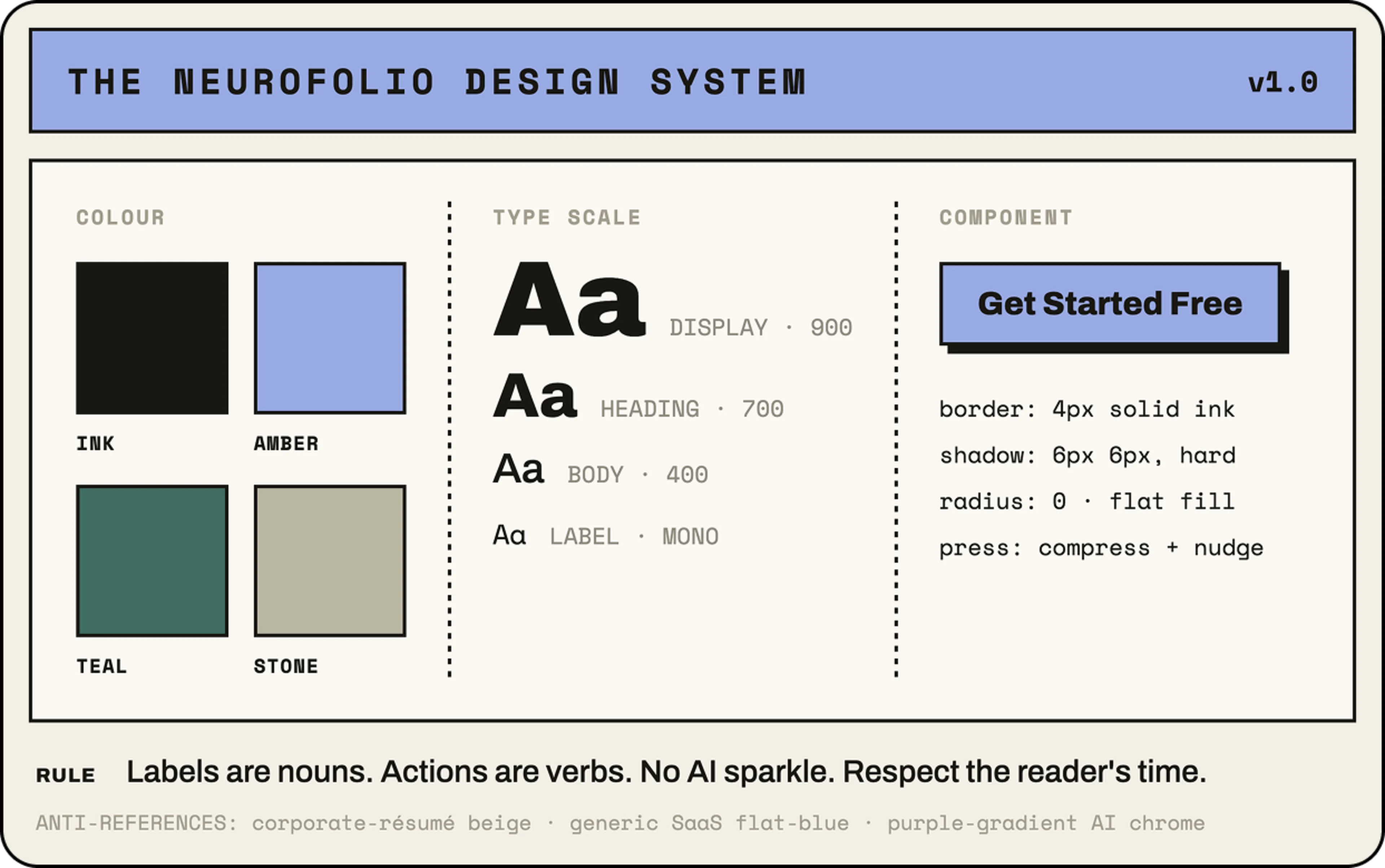
This is Neurofolio — a career-portfolio product whose whole tagline, rather wonderfully, is "Your Professional Brain, Always On." Its look has a name: modern neo-brutalism with micro-interactions. In plain English: heavy borders, flat surfaces, chunky type, a warm near-black core and a stone-coloured backdrop — but everything moves when you touch it. The voice is direct and unfussy. And, crucially, it has a list of things it will never, ever do, which includes purple gradients and sparkle icons. I liked it immediately, partly because it had taste and partly because it had the good sense to know what it hated.
That list of nevers is the secret weapon. A design system isn't really a set of permissions; it's a set of refusals. And refusals are exactly the thing an AI is brilliant at holding onto while you, a tired human at four o'clock, are not.
#One brain, many outputs
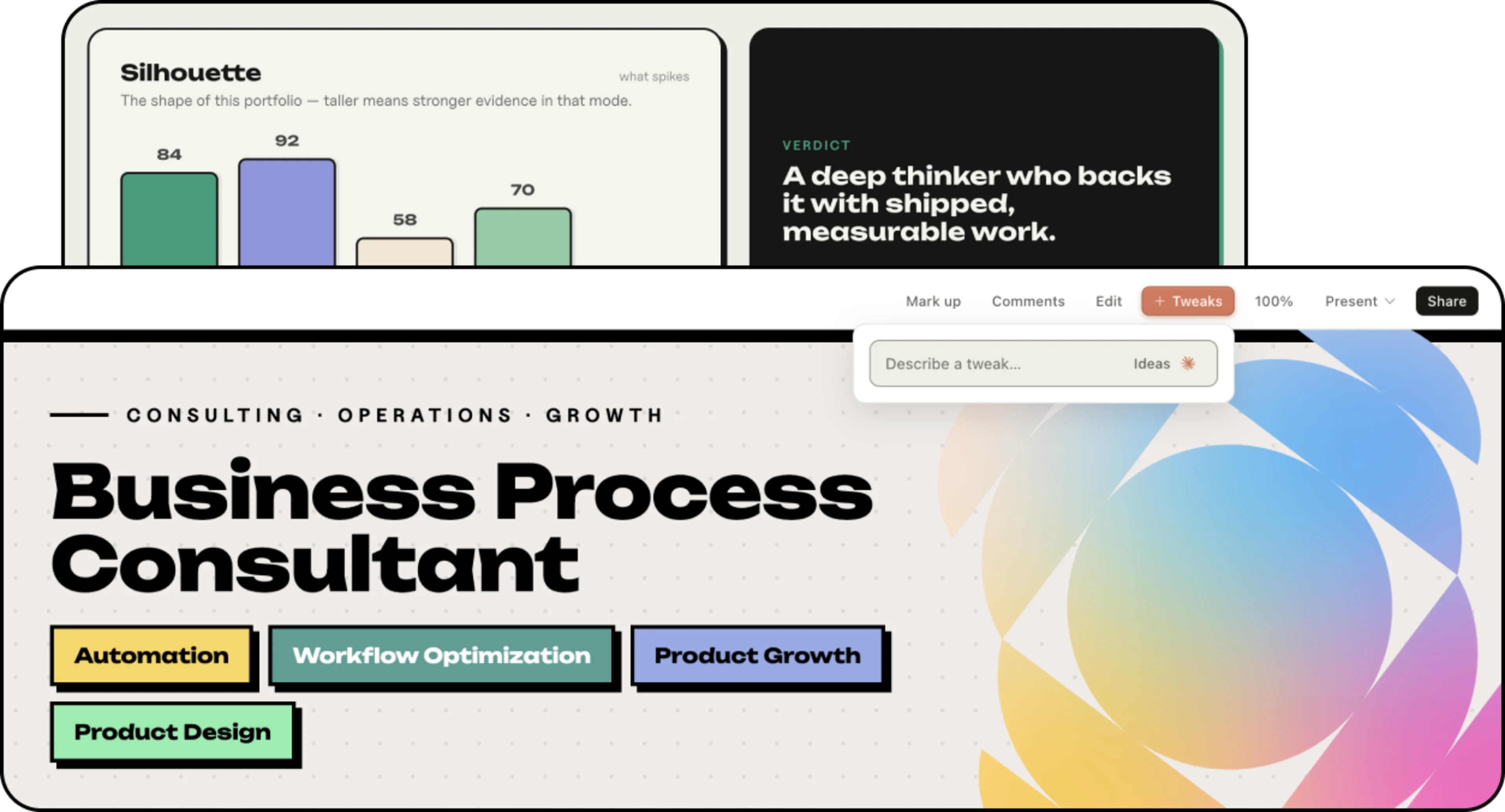
Here's where it gets almost suspiciously satisfying. Neurofolio's entire pitch to its own users is "one private vault, many outputs" — you pour your career into one place, and out come tailored CVs, a portfolio, social posts, the lot. One prompt for a CV, three prompts for a whole portfolio. And the funny thing is that pointing Claude Design at Neurofolio's design system does exactly the same trick, just one floor up. One source of truth, many design materials. The product's philosophy and the way you build the product's marketing turn out to be the same idea wearing different hats.
A design system isn't a set of permissions. It's a set of refusals — and refusals are exactly what a tired human forgets at four o'clock.
So you load the system in, and then you simply ask. A launch banner for the new LinkedIn import feature. A square card for Instagram. An email header. A pricing section for a landing page. You're not nudging buttons; you're having a conversation. "Bit bolder." "Lose the second line." "Make the teal do more work." It answers in the right typeface, with the right borders, in the right voice, every time, because it cannot be bothered to invent a new blue and, more to the point, it has been told not to.
What it is, is the removal of the dull middle. The forty banners collapse into one conversation and a handful of refinements. The afternoon gets its light back.
#Not just banners
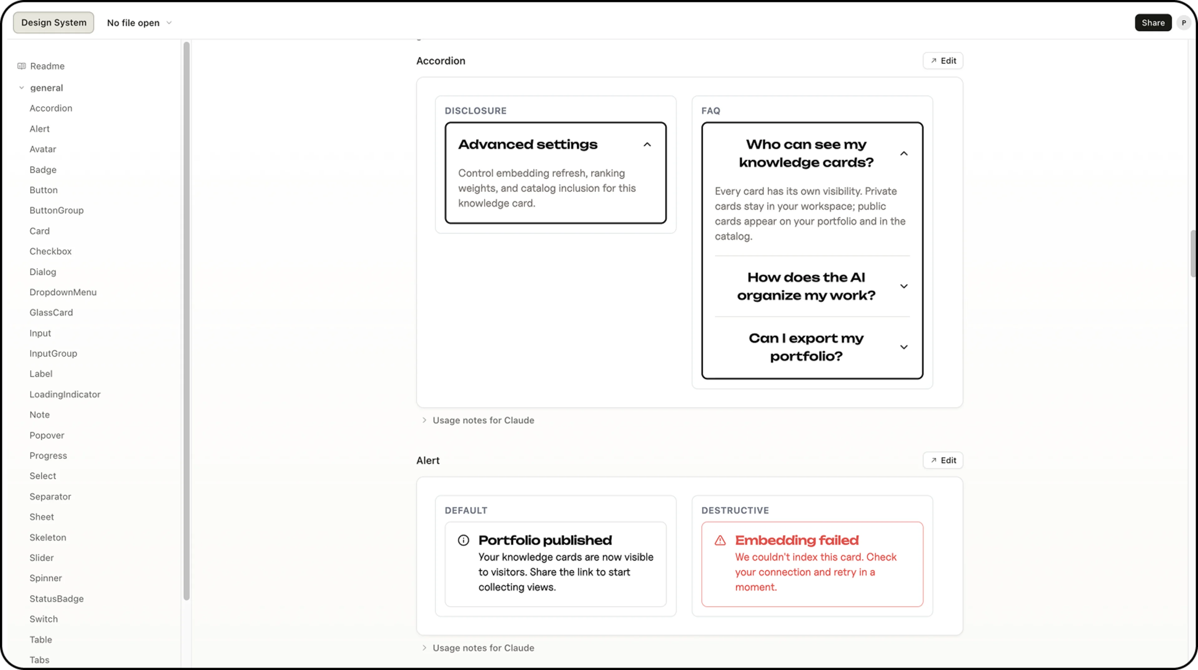
The part that genuinely surprised me was that this doesn't stop at marketing. The same design system, the same conversation, can build actual interface screens. New product UI. Because of course it can — a button is a button whether it lives on a billboard or inside the app, and if the system says buttons are amber with a hard shadow and a press that compresses, then that's true everywhere.
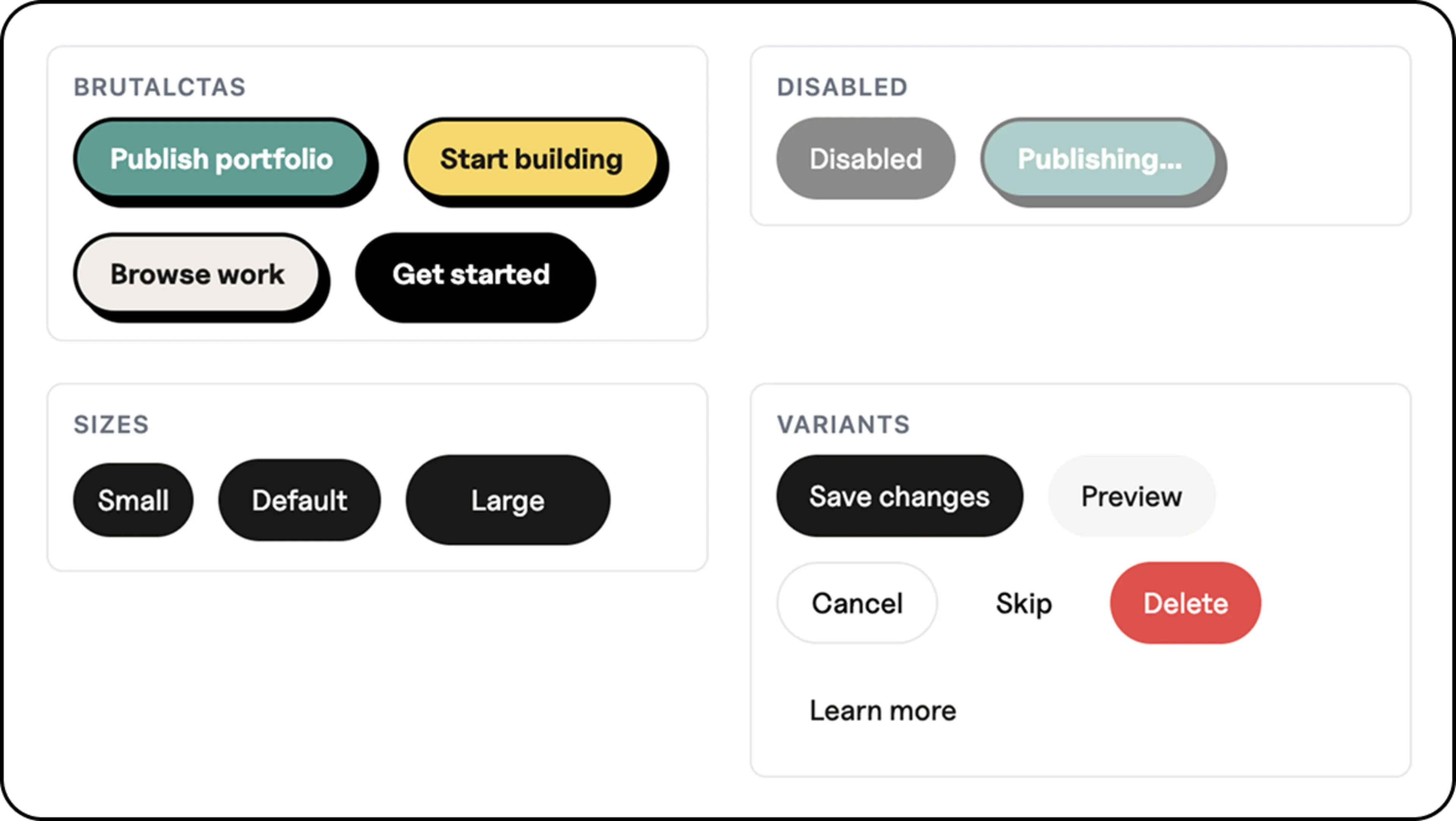
For a product like Neurofolio, this matters more than it might for most. Its whole thing is presenting a person's expertise through "widgets" — a timeline, a knowledge map, a "known for" summary that a recruiter can scan on their phone in roughly the time it takes to decide they're not making a cup of tea first. Every one of those widgets needs to feel like it grew in the same garden. Here's the sort of thing that falls out of the same conversation:
The recruiter who lands on that doesn't know or care that a design system exists. That's the whole point. They just feel that the thing is together — that the person behind it is someone who finishes things. Consistency reads as competence, whether you like it or not, and consistency is the one thing humans are reliably bad at and machines are reliably good at. It's almost rude how well the division of labour works.
#Where we'd still keep the humans
Now, I'd be lying — and you'd stop trusting me, rightly — if I pretended this was a clean win with no asterisks. It isn't. Claude Design will happily give you something 80% of the way there in two minutes, and that last 20% is, as ever, where the actual job lives. The taste is still yours. Knowing that the headline should be six words and not nine, knowing when "punchier" is right and when it's the death of a good idea — that doesn't come out of a prompt. It comes out of you, and the years you spent having those wretched Tuesdays.
What changes is the ratio. You used to spend ninety percent of your time on carpentry and ten on judgement. Now it's the other way round, and judgement was always the part you were good at and secretly enjoyed. The machine takes the bit you were bad at and bored by, which, when you put it like that, is roughly the dream you had at nineteen, just arriving by a route you didn't expect.
It takes the bit you were bad at and bored by, and hands back the bit you were good at and secretly loved. That's the whole deal.
I still make banners and landing pages. I just don't make the same one forty times anymore. I make one, properly, with a system that knows itself and an agent that respects it.
Ready to launch your product with ease?
We're excited to help you elevate your business to new heights!
Posted on Tuesday, June 30, 2026
Updated 4 weeks ago
 Claude
Illustrator

Author